

Data Visualization Development
Turn complex, multi-source enterprise data and AI insights into clear, interactive visual interfaces that drive faster operational decisions.

100%
100% of our clients claim they’d recommend us to the others.
(And they actually do.)
300+
300+ projects within 10 years.
(Because we’re so fast and efficient.)
90%
90% of our team members are senior-level experts.
(Expect nothing but excellence.)
Turn complex data into interfaces people can actually use
Value & Business Impact
Data is only valuable if decision-makers can interpret it instantly. We combine deep engineering capabilities with specialized visualization frameworks (JointJS, yFiles, D3.js) to build interactive dashboards, process mappers, and analytical workspaces tailored to data-heavy domains.

Make data-heavy platforms readable at a glance
Synthesize vast operational databases, real-time telemetry, and complex logs into structured graphical views that reduce cognitive load.
Expose actionable insights from AI & predictive models
Integrate Machine Learning outputs—such as anomaly scores, churn probabilities, or route optimizations—into visually clear risk maps and dashboards.
Visualize multi-node networks and operational workflows
Utilize enterprise diagramming libraries to render complex supply chains, organizational structures, and automated process pipelines.
Serve different operational tiers through role-based views
Deliver high-level KPI summaries for executive alignment while giving frontline operators access to detailed, granular drill-downs.
Replace fragmented static reports with real-time analytics
Consolidate disparate shift logs, Excel files, and legacy databases into unified visual applications updated in real time.
Validate analytics products fast through rapid prototyping
Scope, design, and deploy functional data visualization proofs-of-concept within weeks to secure budget or test user adoption.
What we build for data-heavy products
From executive dashboards to graph-heavy operational tools, we choose the visual model around the decision the interface has to support — not around a generic chart template.

Interactive analytics dashboards
Unify KPIs, live metrics, filters, alerts, and drill-down paths into role-specific analytical workspaces that stay readable as data volume grows.

Process & network diagrammers
Visualize supply chains, organizational structures, system dependencies, and complex operational flows with interactive graph and diagramming components.

Real-time operational views
Stream telemetry and changing backend data into interfaces that update continuously without forcing teams back into static exports and disconnected reports.
Featured Data Visualization Case Studies
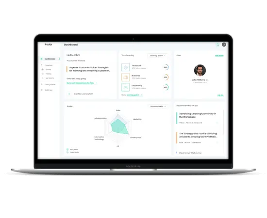

ZF
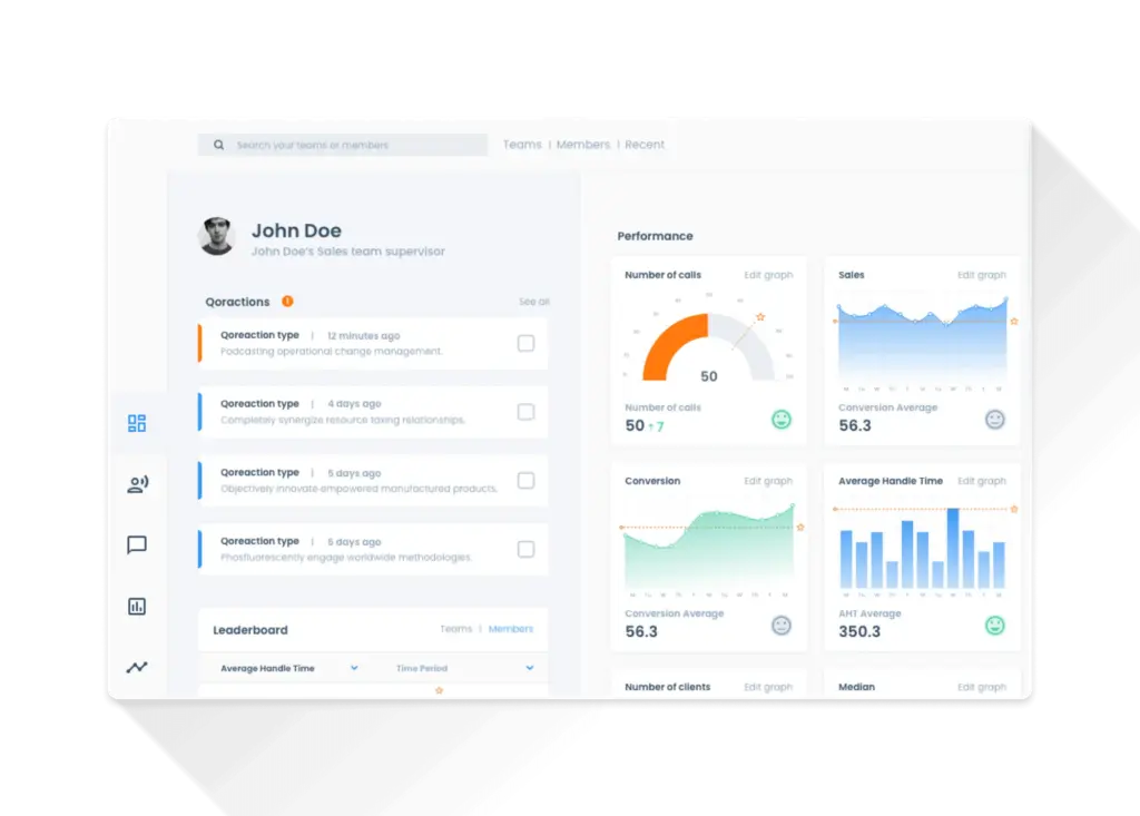
Nanoramic

Apporchid
Need a visual layer that makes complex data easier to act on?
Build your data platformVisualization technology matched to the interaction model
Core visualization frameworks

Custom
graphics
D3.js / SVG


Process
diagrams
JointJS+


Graph visualization
yFiles


Standard analytics
Chart.js


Our Data Visualization Development Process
We start from the data model and the decisions users need to make. Visual hierarchy, interaction mechanics, rendering performance, and integration constraints are validated before the interface is scaled across the product.
01
Workshops
Scoping session to evaluate underlying data architectures, identify primary visual personas, and define key business goals.
02
Kick-off & Information Architecture
Mapping database schemas to visual components, establishing grid layouts, and defining filter/drill-down mechanics.
03
Dashboard Concepts & UX Wireframing
Designing low and high-fidelity mockups focusing on clear visual hierarchy, color systems for alert statuses, and layout flexibility.
04
Frontend & Visualization Development
Building performant visual components using targeted libraries (D3, JointJS+, yFiles, Chart.js) integrated with scalable backend APIs.
05
Validation & Query Optimization
Ensuring visual components update smoothly during live data fetches, dynamic filtering, and complex user interactions.
06
Deployment & System Integration
Handing over production-ready frontend modules, documentation, and providing ongoing support during full rollouts.
Our Tools & Methods
Our visual engineering toolkit covers simple charts up to complex graph architectures:
Technologies
D3.js, JointJS+, yFiles, Chart.js, React, Vue, TypeScript, WebSockets.
Deliverables
Interactive Dashboards, Process Diagrammers, Role-Based Analytics Views, Style Guides & Component Libraries.
Frequently asked questions about data visualization development
When do we need custom data visualization instead of a standard chart library?
Standard charts work well for common comparisons and trends. Custom visualization becomes useful when the product has unusual data relationships, graph structures, dense interaction, domain-specific visual logic, complex drill-downs, or performance constraints that generic components cannot handle cleanly.
Can you visualize outputs from machine learning models?
Yes. Predictions, anomaly scores, probability distributions, recommendations, route optimization results, and other model outputs can be translated into dashboards, maps, risk views, or custom graphics that make the result easier for non-technical users to evaluate.
Can you build process maps and network diagrams?
Yes. For node-link data and operational workflows we can use graph and diagramming frameworks such as JointJS+ or yFiles, depending on layout complexity, interaction requirements, licensing constraints, and the surrounding application architecture.
Can visualizations update in real time?
Yes. Visualization components can consume live API or WebSocket data and update without full-page reloads. The implementation is designed around update frequency, dataset size, filtering behavior, and the rendering technology needed to keep the interface responsive.
Can data visualization be integrated into an existing React or Vue application?
Yes. Visualization modules can be embedded into an existing frontend while keeping component lifecycle, application state, API contracts, and design-system conventions intact.
How do you choose between D3.js, JointJS+, yFiles, and Chart.js?
The choice follows the problem. D3.js is useful for bespoke visual logic, JointJS+ and yFiles for graph and diagramming use cases, and Chart.js for more conventional analytics. We also consider dataset size, interaction complexity, performance targets, existing frontend stack, and maintainability.
Related capabilities for data products
Web app development
Build the application architecture, APIs, and interfaces around your analytical product.
AI development services
Turn predictive models, recommendations, and automated analysis into usable product workflows.
Digital product design
Design information architecture and interaction patterns that keep dense analytical interfaces understandable.
Combine visualization engineering with web development, AI, and product design when the data product needs more than the visual layer.
Contact us: hi@neoteric.eu